

San Tim Energy creates a new look by MadeWithUs.
San Timoteo Energy Associates approached Made With Us to design their new branding and to create and implement the logo and new look on social media, stationery, comms and on their new website: www.santimgreen.com
We were delighted to be asked by Maric and John from San Timoteo Energy (San Tim for short) We really love what they're doing with their business by sustaining the promise of green buildings by working with building designers and operators to achieve green goals. It's a fascinating (if you're into saving the planet and making sure things work past the original design stage, and who isn't?!) and a worthy challenge which they do so well.
They believe that good environmental decisions are good business decisions and with over 50 years of combined facilities operations and project management experience, their specialty is working with buildings and the people who design and operate them to create and maintain environmental and economic sustainability.
San Timoteo Energy Associates is named after San Timoteo Canyon in Southern California - a place close to where the founders grew up and first learned to appreciate the beauty of the natural environment and the fragile nature of desert ecosystems. Our brief was to incorporate Maric and John's love of San Tim and the Californian Oak that grows there. We had also to incorporate a few keywords and key phrases, like - Green, Stewardship, Cradle-To-Cradle and Energy.
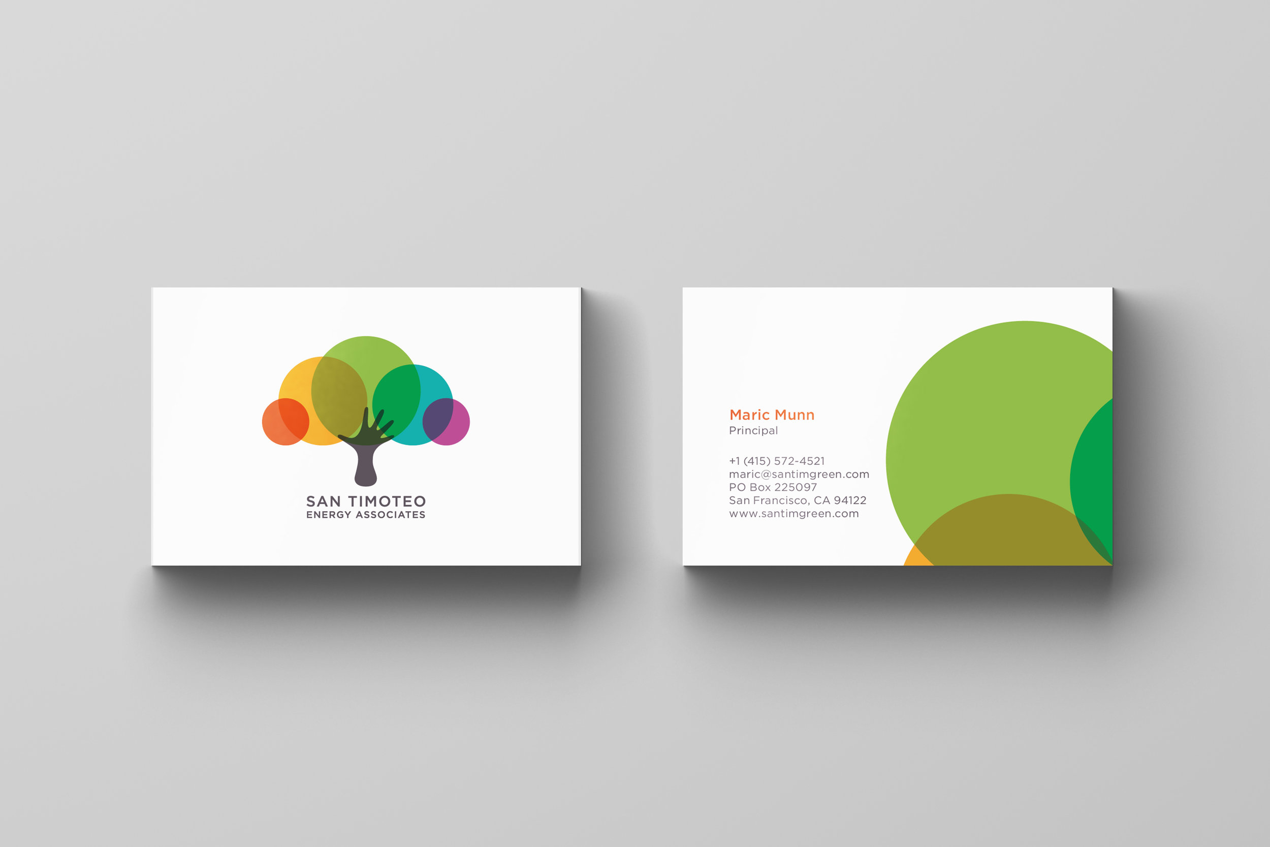
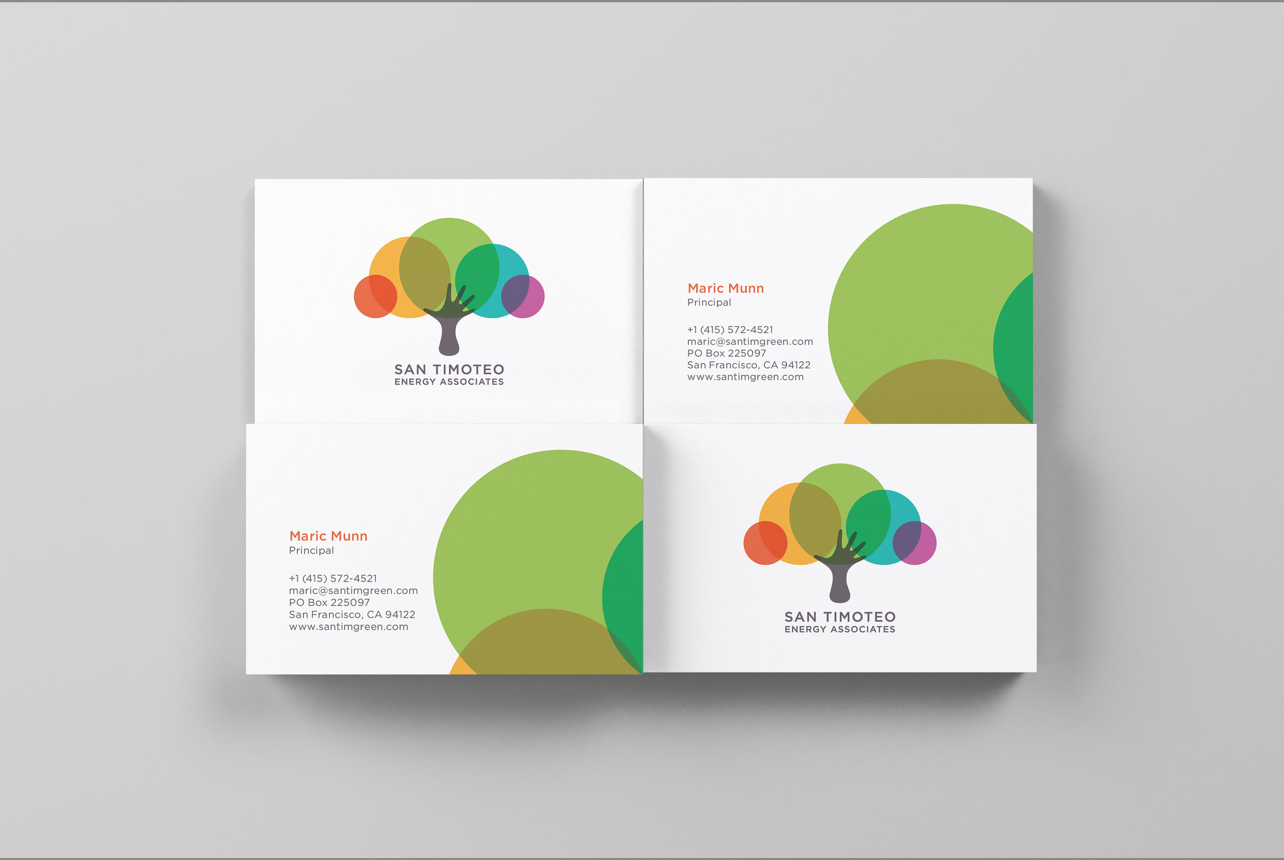
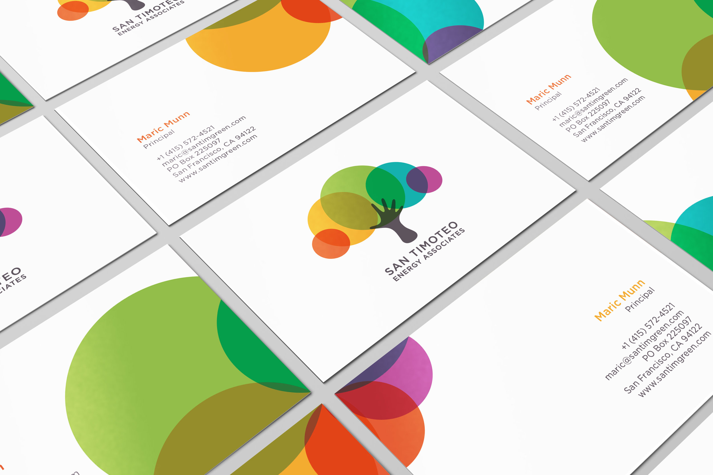
We created ‘A Helping Hand’ logotype.
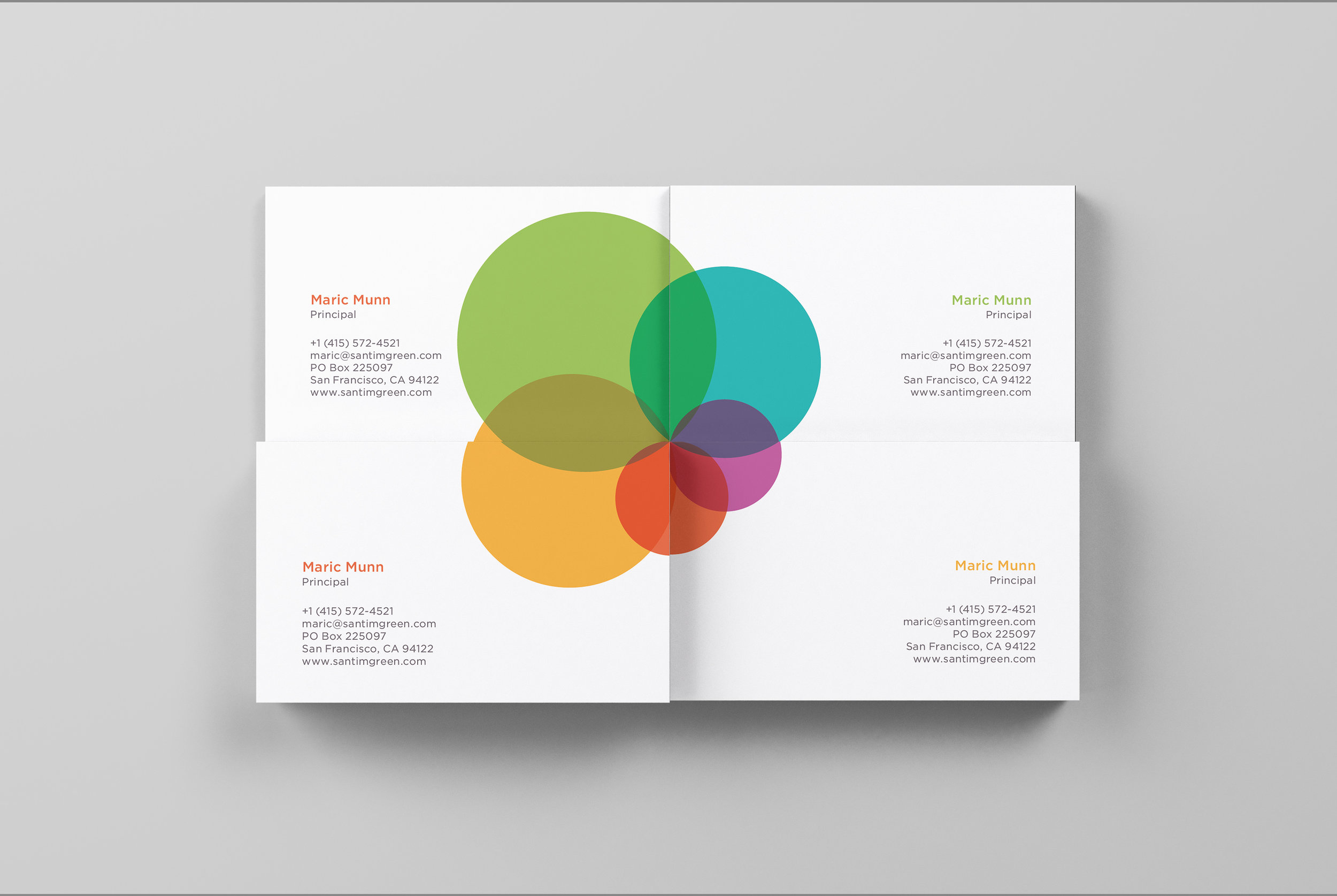
The logo uses colours representing cradle-to-cradle with the ageing of leaves through the seasons. A hand depicting the trunks and branches of the abstract Californian Oak, is posed in a balancing and supportive hold. Designed as an uplifting mark by making the hand, leaves and tree point off to the right and upwards denotes a positive outlook. STE’s logotype has been designed to work as a brand-mark symbol and a word-mark.
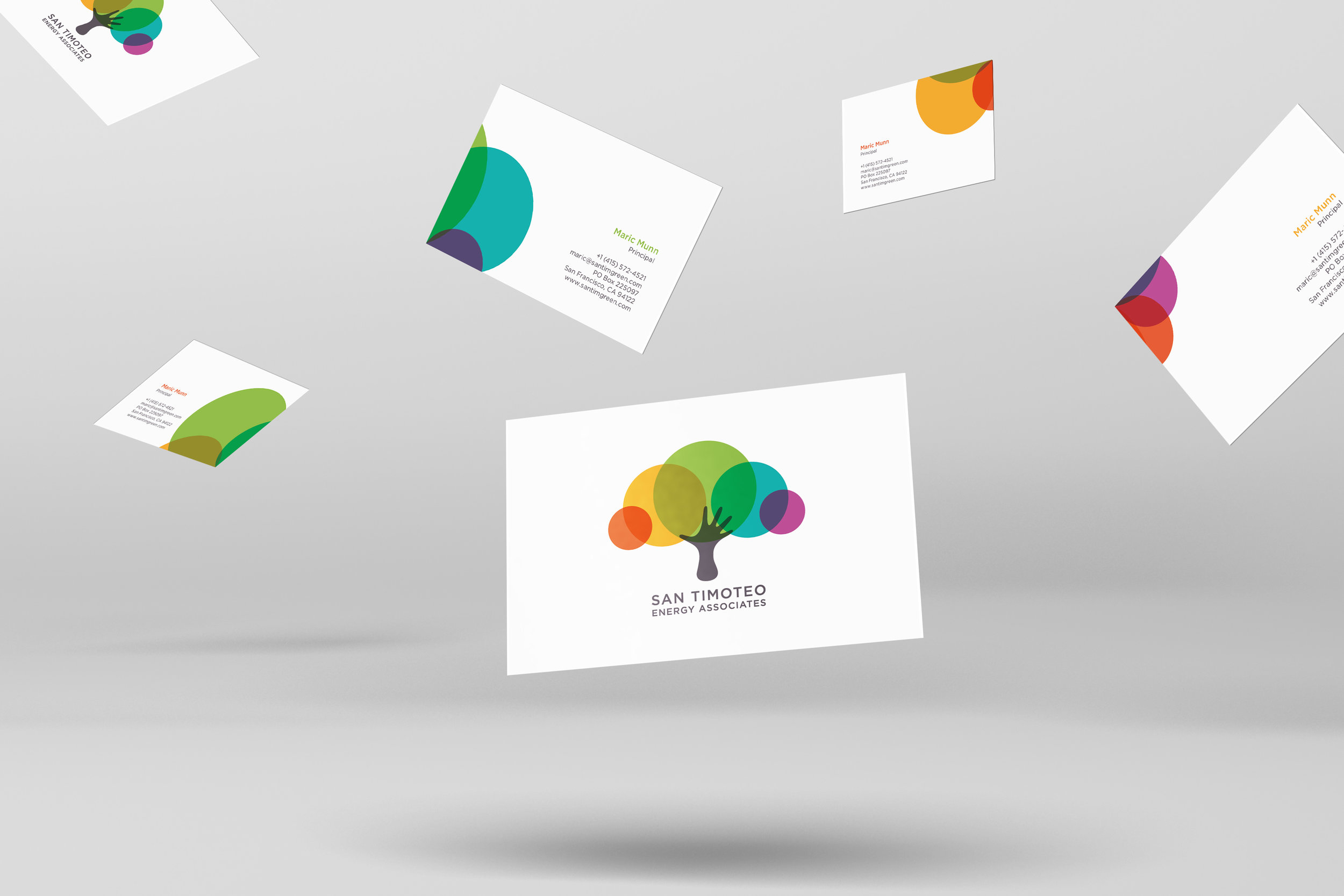
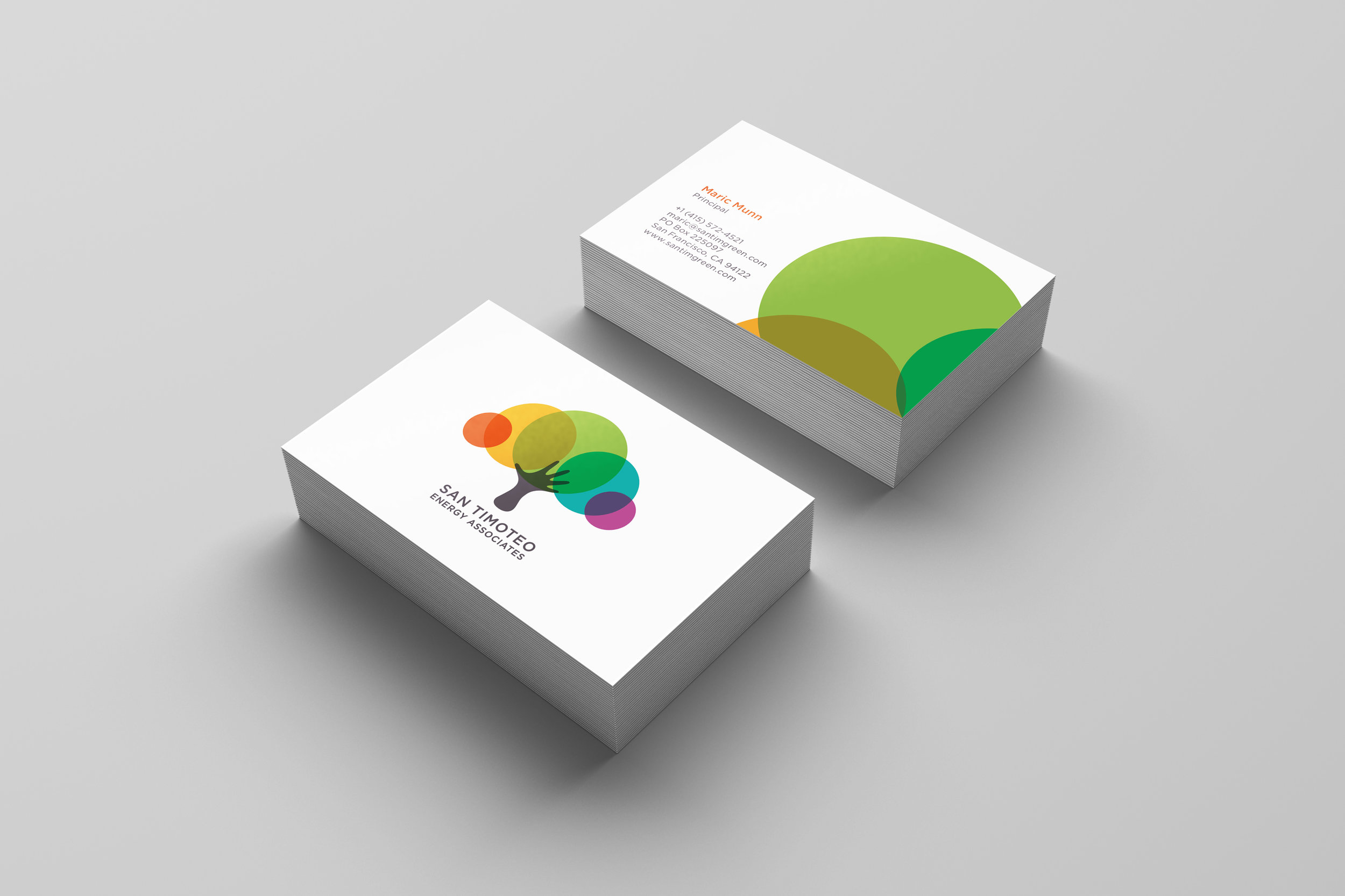
For future proofing and a great splash of colour we carried the coloured circles from the logo to the back of the business cards. When four cards are brought together they create another abstract circle of life. the different backs can be used for different staff members.
We loved creating this brand and new look for STE and they are delighted with the results. We're looking forward to working with them in the future and seeing how they change the work practices and attitudes of people through their work.